




So you’ve decided to build a website. Maybe it’s for your business, a personal portfolio, or a passion project you’ve been sitting on for months. Whatever the reason — welcome. You’re in the right place.
At Larnton Smart Solutions, we work with startups, small businesses, and growing enterprises every day, and one of the most common things we hear is this: “I want a website, but I don’t even know where to start.” That’s exactly what this guide is for.
We’re not going to drown you in tech jargon. By the end of this post, you’ll understand how to plan, structure, and design a modern website that looks great, works well, and actually serves a real purpose. Let’s get into it.
Step 1: Define the Purpose of Your Website Before You Touch a Single Tool
This is the step most beginners skip — and it’s the one that causes the most problems later.
Before you choose a color or pick a font, ask yourself: What is this website supposed to do?
Your answer shapes every decision that follows. A portfolio website has different needs than an e-commerce store. A blog is structured differently from a service business landing page.
Here are some common website types and their primary goals:
- Business/Service Website — Build trust and convert visitors into leads or clients
- Portfolio Website — Showcase your work and get hired
- E-commerce Website — Sell products and drive transactions
- Blog/Content Site — Educate, entertain, and grow an audience
- Landing Page — Drive one specific action (sign-up, download, purchase)
Once you’re clear on the purpose, you can define your target audience. Who are these people? What do they need when they land on your page? What would make them stay — or leave immediately?
Write this down. Seriously. A simple one-paragraph description of your website’s goal and audience will save you hours of confusion later.
Step 2: Plan Your Website Structure (Information Architecture)
Think of your website like a house. Before you decorate any room, you need to know how many rooms there are, how they connect, and what each room is used for.
In web design, this is called information architecture — the way your pages are organized and how visitors move between them.
Start with a sitemap. A sitemap is just a list or diagram showing every page your website will have. For a basic business website, it might look like this:
Home
├── About Us
├── Services
│   ├── Web Design
│   ├── Mobile App Development
│   └── Branding
├── Blog
├── Portfolio / Case Studies
└── Contact
Keep your structure simple. Visitors should be able to find anything on your website in three clicks or fewer. If your navigation is confusing, people leave — it’s that straightforward.
Plan your navigation menu carefully. Your main navigation should include only the most important pages (typically 4–6 items). Anything beyond that creates decision fatigue and visual clutter.
Step 3: Understand the Basic Layout Principles of Modern Websites
Now we get into the visual side. Every modern website, regardless of its niche, follows a set of fundamental layout principles. Learn these, and you’ll be ahead of 80% of beginners.
The F-Pattern and Z-Pattern
Research shows that most people don’t read websites — they scan them. Their eyes typically follow either an F-pattern (scanning across the top, then down the left side) or a Z-pattern (scanning in a Z shape across the page).
What does this mean for you? Place your most important information — your headline, your call-to-action, your key benefit — in the areas where eyes naturally land first. Don’t bury the important stuff at the bottom.
Visual Hierarchy
Visual hierarchy is about making it obvious what’s most important on a page. You control this through:
- Size — Bigger elements draw the eye first
- Color and contrast — Bright or contrasting colors stand out
- Spacing — Isolated elements get more attention
- Typography weight — Bold text reads before regular text
A page without visual hierarchy feels like someone yelling everything at the same volume. A page with hierarchy guides the visitor naturally from the headline to the explanation to the call-to-action.
The Hero Section
The hero is the first large section a visitor sees when they arrive on your homepage. It typically includes a bold headline, a short supporting statement, and a clear call-to-action button (like “Get Started” or “Contact Us”).
Your hero section has one job: make the visitor want to keep scrolling. A strong headline that speaks directly to a problem your audience has is worth more than any flashy animation.
Sections and White Space
Modern websites are divided into clearly defined sections. Each section covers one idea or one content area. Between each section, there’s breathing room — what designers call white space (or negative space).
White space isn’t wasted space. It makes content easier to read, reduces visual noise, and makes your website feel premium rather than cluttered. Don’t be afraid of it.
Step 4: Choose the Right Colors for Your Website
Color is one of the most powerful tools in web design — and one of the easiest to get wrong.
Build a Simple Color Palette
For a beginner, stick to this formula:
- 1 Primary Color — Your main brand color, used for buttons, links, and key accents
- 1 Secondary Color — Complements the primary, used sparingly
- Neutral Colors — Whites, grays, and blacks for backgrounds, text, and structure
A good starting point is to use a tool like Coolors.co or Adobe Color to generate harmonious palettes. Most successful modern websites use no more than 3–4 colors total.
Color Psychology Basics
Colors carry meaning, and your choices communicate something to visitors even before they read a word:
- Blue — Trust, reliability, professionalism (popular with tech and finance brands)
- Green — Growth, health, sustainability
- Orange/Red — Energy, urgency, creativity
- Black/Dark — Luxury, sophistication, boldness
- White/Light — Cleanliness, simplicity, openness
Choose colors that match what you want people to feel when they visit your site.
Contrast is Non-Negotiable
Low contrast between text and background is one of the most common design mistakes beginners make. If your text is hard to read, people won’t read it. Period.
A practical rule: use the WCAG contrast checker (available free online) to ensure your text-to-background contrast ratio meets accessibility standards. Aim for a ratio of at least 4.5:1 for normal text.
Step 5: Typography — Choosing and Using Fonts Correctly
Typography is the art of making text readable, clear, and visually appealing. Poor font choices can undermine an otherwise great design.
Stick to Two Fonts
Use one font for headings and one for body text. That’s it. Any more than two fonts and your site starts to look chaotic.
Good combinations:
- A bold, expressive font for headings + a clean, readable font for body text
- Example: Playfair Display (headings) + Inter (body)
- Example: Poppins (headings) + Open Sans (body)
Google Fonts has hundreds of free, high-quality options that load fast and look professional.
Font Sizes Matter
A common sizing scale for web:
- Body text: 16px minimum (never go smaller — it strains the eyes)
- H3 subheadings: 20–24px
- H2 section headings: 28–36px
- H1 hero headlines: 40–64px (or larger on desktop)
Give your text room to breathe with proper line spacing (line-height). A line-height of 1.5–1.6x the font size is a good starting point for body text.
Step 6: User Experience (UX) — Design for People, Not Just Aesthetics
At Larnton, we often say: We deliver designs that work, not just designs that look good. This is the heart of User Experience (UX) design.
UX is about making sure your website is easy, intuitive, and enjoyable to use. A beautiful website that confuses visitors is a failed website.
Make Navigation Obvious
Your navigation menu should be in the same place every visitor expects it: at the top of the page. On mobile devices, use a hamburger menu (the three-line icon) that expands when tapped.
Every page should have a clear way to get back to the homepage (usually the logo in the top left corner). Never trap visitors in dead-end pages.
Design Clear Calls-to-Action (CTAs)
A call-to-action (CTA) is a button or link that tells the visitor what to do next: “Get a Free Quote,” “Start Your Project,” “Download Now.” Every page should have at least one clear CTA.
Make your CTAs:
- Visually distinct — Use your primary brand color
- Action-oriented — Start with a verb (“Get,” “Start,” “Download,” “Book”)
- Specific — “Get My Free Consultation” performs better than “Click Here”
Design for Mobile First
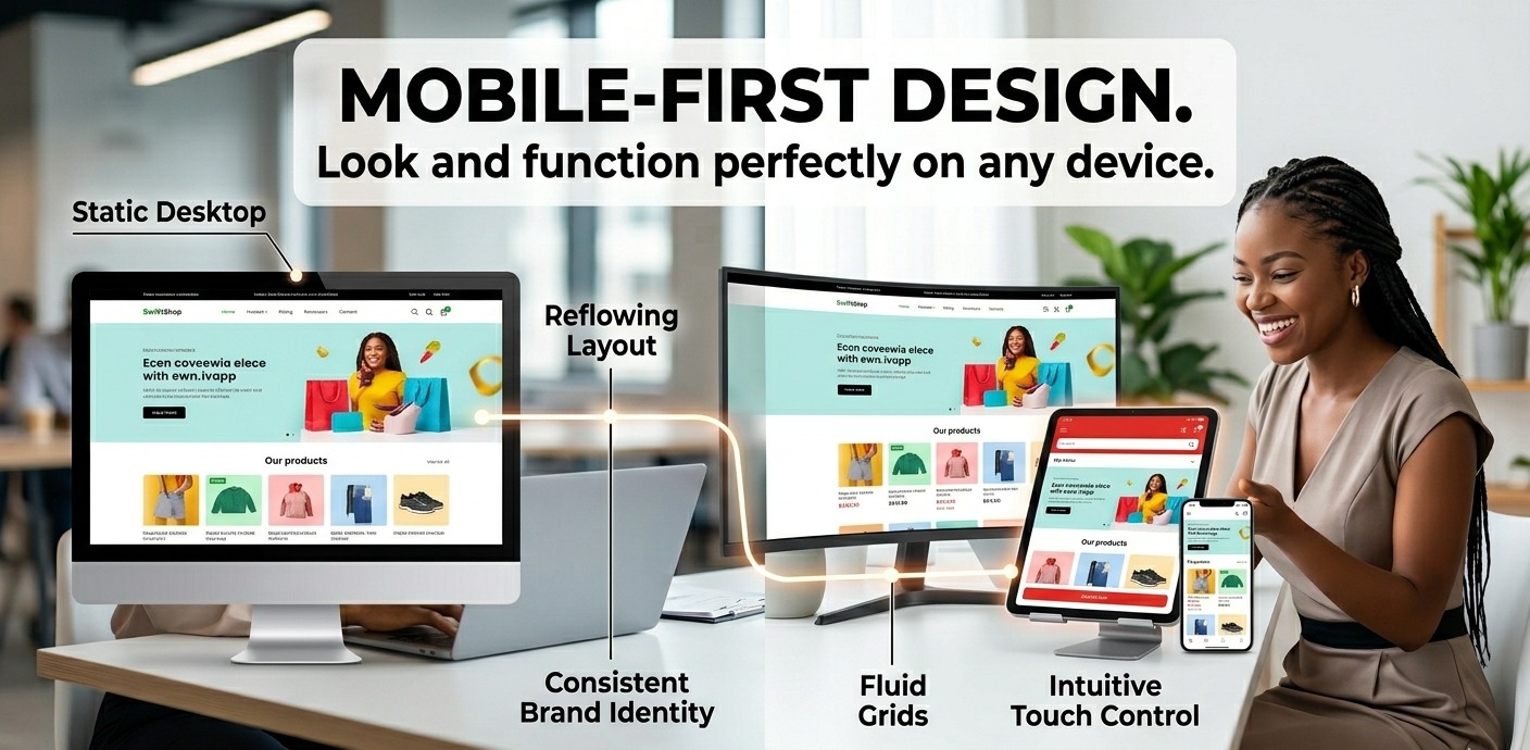
More than half of global web traffic comes from mobile devices. In Nigeria, mobile internet usage is even higher. Designing “mobile first” means you plan the mobile layout before the desktop layout, ensuring your website works perfectly on small screens.
Key mobile design principles:
- Touch targets (buttons, links) should be at least 44x44px
- Text should be readable without zooming
- Avoid elements that require hovering (hover doesn’t exist on touch screens)
- Images and layouts should adapt fluidly to different screen sizes
This adaptability is called responsive design and it’s not optional — it’s a baseline expectation for any modern website.
Page Speed is a UX Issue
A page that loads slowly is a bad user experience. Studies consistently show that if a website takes more than 3 seconds to load, over half of visitors leave.
A few simple ways to improve speed:
- Compress images before uploading (use tools like TinyPNG or Squoosh)
- Use modern image formats like WebP
- Minimize the use of heavy plugins and scripts
- Choose a reliable, fast web hosting provider
Step 7: Choose the Right Tools and Platform
You don’t have to write code to build a modern website. Here’s a quick overview of the most popular options:
For beginners with no coding experience:
- WordPress — The most widely used CMS in the world. Highly flexible with thousands of themes and plugins. Best for blogs, business sites, and portfolios.
- Webflow — A powerful visual design tool that gives you more design control without coding. Excellent for polished, custom designs.
- Wix / Squarespace — Drag-and-drop builders that are very easy to start with, though less flexible at scale.
For those learning to code:
- HTML, CSS, and JavaScript form the foundational trio of web development. Learning even the basics gives you enormous control over your designs and helps you communicate better with developers.
Step 8: Test, Launch, and Iterate
Before you launch, test everything:
- Click every link — broken links are unprofessional
- Test on multiple devices (phone, tablet, desktop) and multiple browsers (Chrome, Safari, Firefox)
- Fill out every form and confirm it submits correctly
- Check all images are loading
- Read every piece of copy out loud to catch errors
After launch, your job isn’t finished. Use free tools like Google Analytics and Google Search Console to track how visitors find and use your site. The data tells you what’s working and what needs to be improved.
Great websites aren’t built in a day. They’re refined over time based on real feedback from real users.
Final Thoughts: Good Design is About People
If there’s one thing to take away from this guide, it’s this: good website design is always about people. It’s not about impressing designers or following trends for the sake of it — it’s about making it easy for the right visitors to understand who you are, trust you, and take action.
That’s exactly the philosophy we operate with at Larnton Smart Solutions. We don’t just build websites that look good. We build websites that convert visitors into customers, communicate your brand clearly, and grow with your business.
Whether you’re a startup finding your footing or an established business ready for a digital transformation, the principles in this guide are your starting point. Take them seriously, apply them thoughtfully, and you’ll be well ahead of the curve.
Need help designing or building your website? At Larnton Smart Solutions, we offer end-to-end digital services — from web design and development to branding and ongoing digital support. We take the time to understand your business, your users, and your goals — then build something that truly works.
👉 Get Started with Larnton Smart Solutions
Larnton Smart Solutions — Smart Ideas. Practical Execution. Real Results.